Dashboarding with PowerBI

In this post, I write about the development of dashboarding skills in the Microsoft Power BI interface.
Introduction
With the continuation of lockdown, I decided to complete an introductory course on Power BI. It’s a tool my colleagues use to produce and share reports, and one which I thought would be useful for creating my own reports, or at least for speaking a common language with those who do.
I enrolled in ‘Power BI A-Z: Hands-On Power BI Training for Data Science!’ for 5 hours of video lectures to get started, spread over a working week. A grandiose course title is rarely the mark of a course which exceeds expectations but, to its credit, the course had a hands on approach (mock datasets supplied) as advertised, which was a priority for me. Whilst not the thorough A-Z Data Science Primer suggested, I feel in a good position to further develop my capability on review.
Process
With the PowerBI desktop downloaded and set up, the course walked through the following topics.
- Loading data
- Transforming Data Types
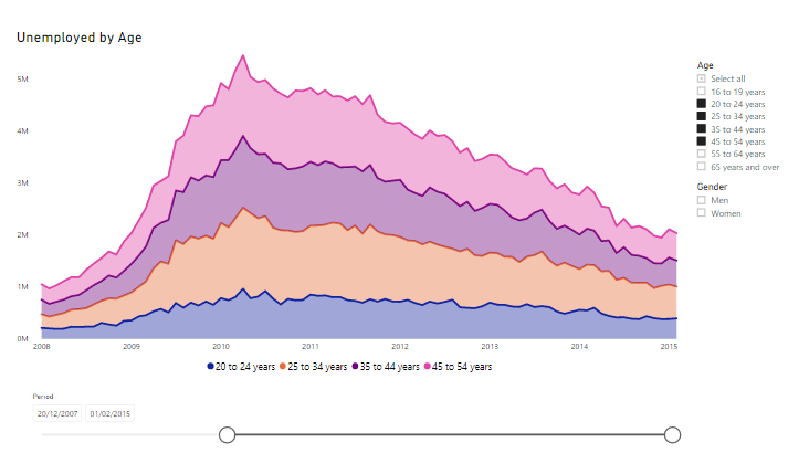
- Producing a range of charts (Bar/Line/Area/Scatter/Chord/Maps)
- Using Slicers to adjust filters
- Drilling up and Down on charts
- Using measures and creating new columns
I see these as fundamental processes in the field of report building. Simply, the bread and butter which, on their own, are not particularly inspiring. A couple of challenges I did find with the course:
- Microsoft frequently releases new PowerBI updates; rendering some course material out of date.
- Software seemed slow to use for some formatting tasks. I would make a point of searching for more efficient methods if I were to use this more.

Dashboard Presentation
What I found more interesting as an output of spending time in PowerBI, was the painstaking design considerations of creating a dashboard. I’m not a natural designer, and I find it difficult to manage the lack of rules and rigour in this creative domain. The PowerBI interface is straightforward and much can be accomplished through ‘drag and drop’, there wasn’t a line of code insight. It was only when the charts were created that I found a real challenge: Design.
I spent far longer on the presentation of the charts, than on making them. It was an experiment. Considering the best use of space, of chart ratios, of colours, of fonts, all contributed to a shift of emphasis in the final dashboard.
On several occasions, I approximated the golden ratio with chart dimensions, but beyond this I felt left in the dark!

I enjoyed having a play in PowerBI. While I still do not consider this my forte, I’ll certainly appreciate the design of a clear report when I next see one.
Until Next Time,
Scott

